Lately, I've been mastering the Gimp Program pretty darned well, and I've been helping an awesome mibbian out with it (you know who you are!) and I decided to come make a tut to help some others too. I'll try to make this as simple as possible, but you're going to have to be familiar with Gimp to really understand, yeah?
step oneOpen a new document (
file > new) with the size of 5OOx15O.
Fill this document with
ececec. You'll need to find
two pictures that have the same, or similar background. I went
here and got these two:
a -
b images.
step twoOnce you find your two images, paste them into the document as two different layers. (
edit > paste as > new layer) Set one of the layers to invisible (preferably the top one), so it should look like
this.
step threeWe're going to work with the first image you added, which is the one that
isn't invisible. Whether you're using the same image as I, or a different one, scale it down so that it fits on the background the way you like it. I suggest not scaling it too much, because although scaling in gimp doesn't blur the image, too much scaling can make it look uneven.
step fourNow set the invisibility, like before on that image, and click the invisibilty on the image above that one. You're going to do the same, and scale it, but make sure, its wide enough to overlap on the image below it. Now after you scale it, you might want to switch the images around to see which one you'd rather blend into the other. I took the first layer image, and raised it (green arrow pointing up) so its on top of the second layer (be sure to take the invisibilty off both layers). I stuck my
first image on the left of the page, and my
second image on the right, and had the
first image blend into the
second image, which we will get into in the next step.
step fiveAfter rearranging your images (should look similar to
this) we are going to get out the fuzzy brush (
paintbrush > brush > circle fuzzy [19]) which looks like
this. I set my scale to
1.OO. Now carefully brush away the background on the top layer on the
right side of the image so that it reveals the background of the bottom layer.
Your image should now look similar to
this.
step sixNow the hard part is over (but it wasn't really all that hard now was it?), so go and flatten your image (
image > flatten image) Now this is an optional step, keep in mind. Next I went and duplicated the image (
image > duplicate) and then sharpened it (
filters > enhance > sharpen) my the second layer (the duplicate of the image) with the setting of
93. I then set the
mode to
screen and the opacity (underneath mode) to
83.1. Then I flatten (
image > flatten image) the image. This gives the image a bit more definition, but is completely optional!
step sevenNow we're going to add a few textures to make it look even more pretty. I took
this texture, and pasted it as a new layer (
edit > paste as > new layer) and then I desaturated it (
colors > desaturate). Then I moved it towards the right, so it was sort of over the man, and I set the
mode to
lighten. (
texture cred)
step eightAlright, we are at the end now. First, flatten (
image > flatten image) your image and then click on the text tool (looks like a nice big
A) and type in some text, you know make it look cool. And then flatten (
image > flatten image) your image again. And
voila! you are done.
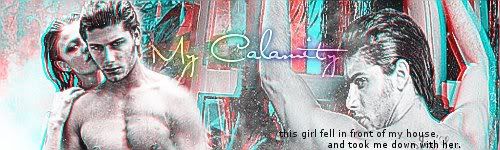
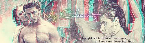
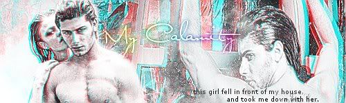
This is my final productHere are few extras that you can do to change the coloring:
with vintage effectcyan: 17.
magenta: 20.
yellow: 59.
productcolorize effect o1First, add a new layer (
layer > new layer). Fill it with
ececec. Set the
mode to
soft light. Set the
opacity to
78.9. Flatten image (
image > flatten image).
productcolorize effect o2Go to color balance (
colors > color balance). Under midtones change the settings to this:
Cyan: 40
Magenta: -22
Yellow: -24
product 


