
My other resource blog can be found here.
I like fonts! I can walk into almost any store and identify almost any font.
But there are some fonts that I do not like. This blog is tailored to book covers, mainly.
Fonts that I don't like:
Comic Sans MS
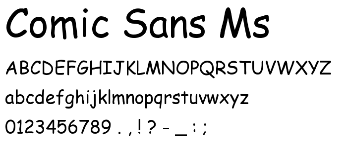
I cannot take this font seriously. Especially when people use bright red comic sans against a gray background in powerpoint. NO. Are you five-year-old with a lemonade stand? No. So don't use it. It can work, but that's very rare so don't use it.
Curlz MT

I don't loathe this font...per se. It can work in adverts, but not if you're designing a book cover. It's unprofessional.
Daniel

It's not that I don't like this font, because I do. I really do; just not for book covers and story banners. It's unprofessional.

I see this goddamn font everywhere because Texas. They think that this is the only font. It's unprofessional. It just...ew.
More fonts that I like but not for story covers (they're overused):

Examples of poorly designed book covers:
Okay, I try not to judge a book by its cover, but if it's obvious that it was done in Wordart, I will not touch that fucker.

Is this an actual book?


OH AND DID I MENTION PAPYRUS? THAT FONT IS A NO-NO AS WELL