New new Mibba

  • Aightball

    Aightball (100)

    :
    Member
    Gender:
    Age:
    45
    Location:
    United States
    I did notice yesterday when I went into a story, the banner and such was eaten up by the layered bars at the top. Is there a way to put all that stuff onto one or maybe two smaller bars? Because right now, on my small screen, stories are scrunched now =(
    July 22nd, 2012 at 04:28pm
  • thelastpainter

    thelastpainter (110)

    :
    Member
    Gender:
    Age:
    29
    Location:
    United States
    @ Aightball

    I have a pretty small screen on the computer I have, and it's not doing that for me. Think It may be something else, like a glitch, or even a problem with your browser than the screen. What kind of browser do you use? (it could be your screen size, I know that a few folks have had problems with how the layout of Mibba is with bigger sreens. So I'm not sure.)
    July 22nd, 2012 at 04:52pm
  • X_hello_hello_X

    X_hello_hello_X (100)

    :
    Member
    Gender:
    Age:
    30
    Location:
    Canada
    Im just wondering if im the only one having this problem but i can never open the authors page which is really annoying id like to know who the authors of the stories i read are and they never work. Can someone explain this to me?
    July 22nd, 2012 at 05:14pm
  • ladyschrei

    ladyschrei (550)

    :
    Member
    Gender:
    Age:
    29
    Location:
    United States
    @ X_hello_hello_X
    What do you mean, you can't open them? What happens when you click the link in a story?
    July 22nd, 2012 at 05:54pm
  • DiamondInTheRough.xo

    DiamondInTheRough.xo (100)

    :
    Member
    Gender:
    Age:
    32
    Location:
    United States
    The new set up is cool, I really like it. I just think that its way too wide, the width on New Mibba 1.0 was better I think. Other than that I think its great.
    July 22nd, 2012 at 06:03pm
  • Mrs. Whirly

    Mrs. Whirly (155)

    :
    Member
    Gender:
    Age:
    32
    Location:
    United States
    @ capture me inside.

    @ Aightball

    It's actually doing the same thing to me. I took a handy dandy picture:
    Image
    (sorry for being wide)

    At least this is what I am thinking you are talking about Aightball.

    I also have to zoom in (but that's on every website because my eyes are so bad) and I thought that me zooming in was the problem to why it was bulkly but I changed it back to the original res and it's still like that. So I don't think it could be people zooming in.
    July 22nd, 2012 at 06:38pm
  • thelastpainter

    thelastpainter (110)

    :
    Member
    Gender:
    Age:
    29
    Location:
    United States
    @ Mrs. Whirly

    It's doing that for me too...I just looked at your story to see if it was. Maybe it's not a glitch or anything, but how it looks in general? It just might look odd, but I'm not sure.

    Yeah, I'm looking at the color of the status bar on a story of mine, and it's the color and that the sequel/prequel buttons show up above it.

    If that's what it is...

    @ Aightball

    If that's what it's doing for you, I'd try and put a space between the status/prequel things and it'd probably look better and not cover the banner.
    July 22nd, 2012 at 06:47pm
  • Mrs. Whirly

    Mrs. Whirly (155)

    :
    Member
    Gender:
    Age:
    32
    Location:
    United States
    @ capture me inside.
    It's not a big deal to me. I put it in the suggestion forum but I understand there are more pressing matters that Dujo has to handle.
    July 22nd, 2012 at 06:54pm
  • X_hello_hello_X

    X_hello_hello_X (100)

    :
    Member
    Gender:
    Age:
    30
    Location:
    Canada
    @ ladyschrei
    it goes to an untitled page...
    July 22nd, 2012 at 06:58pm
  • ladyschrei

    ladyschrei (550)

    :
    Member
    Gender:
    Age:
    29
    Location:
    United States
    @ X_hello_hello_X
    Same thing is happening to me, I just checked.
    July 22nd, 2012 at 07:33pm
  • Aightball

    Aightball (100)

    :
    Member
    Gender:
    Age:
    45
    Location:
    United States
    capture me inside.:
    @ Mrs. Whirly

    @ Aightball

    If that's what it's doing for you, I'd try and put a space between the status/prequel things and it'd probably look better and not cover the banner.
    How do I do that? I'm talking stories I read on here, not ones I'm putting up =).

    @capture me inside I'm using FireFox

    @Mrs. Whirly What I'm seeing is this:

    Image

    It's kind of scrunching everything (but I also have a...14" screen, I think?) so not sure if it's my screen or if it's the change.
    July 23rd, 2012 at 12:12am
  • thelastpainter

    thelastpainter (110)

    :
    Member
    Gender:
    Age:
    29
    Location:
    United States
    @ Aightball

    If you don't mind, would I be able to send a message explaining it? It'd be easier that way. It also might be that you don't have chrome, but as far as I know the layout maker and layouts work fine now for other browsers. But I've still heard a couple problems so it could possibly be that. (I have chrome, so I wouldn't entirely know if it would right now.)
    July 23rd, 2012 at 12:14am
  • Bella Goes Away.

    Bella Goes Away. (860)

    :
    Member
    Gender:
    Age:
    102
    Location:
    Yemen
    @ Aightball
    I genuinely don't see an issue with that image.
    July 23rd, 2012 at 12:19am
  • Jack Donaghy

    Jack Donaghy (450)

    :
    Member
    Gender:
    Age:
    33
    Location:
    United States
    Wait, I'm confused – is the issue with story layouts that they're getting cut off by the prequel/sequel bar or just that people don't like that they're being pushed down? Mine definitely aren't being cut off. Obviously with the new bar the layout starts 30px lower or however much, but it's all still there; nothing being covered up. I checked on Firefox and Chrome.
    July 23rd, 2012 at 12:31am
  • Aightball

    Aightball (100)

    :
    Member
    Gender:
    Age:
    45
    Location:
    United States
    battalions:
    Wait, I'm confused – is the issue with story layouts that they're getting cut off by the prequel/sequel bar or just that people don't like that they're being pushed down? Mine definitely aren't being cut off. Obviously with the new bar the layout starts 30px lower or however much, but it's all still there; nothing being covered up. I checked on Firefox and Chrome.
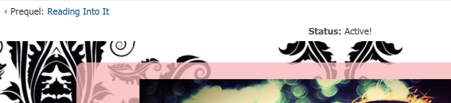
    For me, it's that the banners are partly covered and things are a bit squished. If I go into full screen, it gets better, but I don't always think to do that. What I've got are stacked "bars" and it's squishing everything down for me.

    @bella: it's pretty squished with the bars all stacked above the banner and part of the banner is covered now.

    @capture: go for it =), my mail box is always open =)
    July 23rd, 2012 at 12:37am
  • Mr. Darcy

    Mr. Darcy (16090)

    :
    Article Editor
    Gender:
    Age:
    27
    Location:
    Great Britain (UK)
    Are the 'My Mibba', 'Profile', 'Messages' and etc. bar meant to have little icons above the individual buttons? I saw Aightball's screenshot had them but mine's just got blank spaces above the labels.
    July 23rd, 2012 at 01:04am
  • ladyschrei

    ladyschrei (550)

    :
    Member
    Gender:
    Age:
    29
    Location:
    United States
    @ castiel's vessel
    Do you mean like how it's the house for the My Mibba Page, a portfolio-looking thing for the Profile page, etc.?

    If so, then yes. Mine has blank spaces above the labels when I'm on Mibba using my phone, but on my laptop the icons are there.
    July 23rd, 2012 at 01:10am
  • Mr. Darcy

    Mr. Darcy (16090)

    :
    Article Editor
    Gender:
    Age:
    27
    Location:
    Great Britain (UK)
    @ ladyschrei

    Yeah, that's what I mean. It's a blank space even on my laptop. I'm using Internet Explorer as well. It's not something that bothers me but I just wondered because of the screenshot.
    July 23rd, 2012 at 01:14am
  • Audrey T

    Audrey T (6730)

    :
    Admin
    Gender:
    Age:
    35
    Location:
    United States
    @ ladyschrei
    Oh, that's because when you're on your phone you're automatically taken to the mobile site, which doesn't have those icons at the top.
    July 23rd, 2012 at 01:14am
  • ladyschrei

    ladyschrei (550)

    :
    Member
    Gender:
    Age:
    29
    Location:
    United States
    @ castiel's vessel
    I'm using Chrome, so I dunno O.o;

    @ Audrey T
    How different is the mobile version supposed to look? Lol because the website is the same for me on my phone, just the icons are gone. Lol.
    July 23rd, 2012 at 01:15am