
How to Create a Banner With Gimp
 First of all, if you do not have Gimp you can get the full, free version here.
Second, no real skill is required to make this banner. All you need is some knowledge of the tools (i.e. know what the soft brush is) and I'll think you'll be able to do this.
Okay, so here we go:
Step One
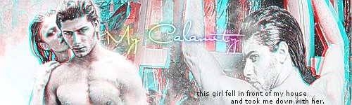
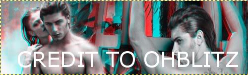
Open a new document (file > new) with the size of 5OOx15O. Fill this document with ececec. You'll need to find two pictures that have the same, or similar background. I went here and got these two images:
Step Two
Once you find your two images, paste them into the document as two different layers (edit > paste as > new layer). Set one of the layers to invisible (preferably the top one).
Step Three
We're going to work with the first image you added, which is the one that isn't invisible. Whether you're using the same image as I, or a different one, scale it down so that it fits on the background the way you like it. I suggest not scaling it too much, because although scaling in gimp doesn't blur the image, too much scaling can make it look uneven.
Step Four
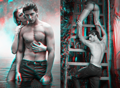
Now set the invisibility, like before on that image, and click the invisibilty on the image above that one. You're going to do the same, and scale it, but make sure, its wide enough to overlap on the image below it. Now after you scale it, you might want to switch the images around to see which one you'd rather blend into the other. I took the first layer image, and raised it (green arrow pointing up) so its on top of the second layer (be sure to take the invisibilty off both layers). I stuck my first image (the image on the left above) on the left of the page, and my second image (the image on the right above) on the right, and had the first image blend into the second image, which we will get into in the next step. Your image should look like this:
Step Five
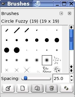
After rearranging your images, we are going to get out the fuzzy brush (paintbrush > brush > circle fuzzy [19]) which looks like this:
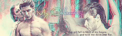
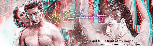
I set my scale to 1.OO. Now carefully brush away the background on the top layer on the right side of the image so that it reveals the background of the bottom layer. Your image should now look similar to this:
Step Six
Now the hard part is over (but it wasn't really all that hard now was it?), so go and flatten your image (image > flatten image). Now this is an optional step, keep in mind. Next I went and duplicated the image (image > duplicate) and then sharpened (filters > enhance > sharpen) my the second layer (the duplicate of the image) with the setting of 93. I then set the mode to screen and the opacity (underneath mode) to 83.1. Then I flatten (image > flatten image) the image. This gives the image a bit more definition, but is completely optional!
Step Seven
Now we're going to add a few textures to make it look even more pretty. I took this texture, and pasted it as a new layer (edit > paste as > new layer) and then I desaturated it (colors > desaturate). Then I moved it towards the right, so it was sort of over the man, and I set the mode to lighten (texture cred).
Step Eight
Alright, we are at the end now. First, flatten (image > flatten image) your image and then click on the text tool (looks like a nice big A) and type in some text, you know to make it look cool. Then flatten (image > flatten image) your image again. And voila! you are done.
Here are few extras that you can do to change the coloring:
Vintage effect
cyan: 17.
magenta: 20.
yellow: 59.
Colorize effect o1
First, add a new layer (layer > new layer). Fill it with ececec. Set the mode to soft light. Set the opacity to 78.9. Flatten image (image > flatten image).
Colorize effect o2
Go to color balance (colors > color balance). Under midtones change the settings to this:
Cyan: 40
Magenta: -22
Yellow: -24
Latest tutorials
-

How to Make a Simple Banner in GIMP
January 25th, 2014 at 05:29am
-

How to Successfully Code a Signature for Mibba
August 10th, 2013 at 08:32am
-

How to Make a Blue Hued Icon Using Photoshop
February 1st, 2013 at 06:38am
-

How to Change Light Hair Color on GIMP
July 23rd, 2012 at 01:37am
-

How to Make a Mibba Story Layout
July 20th, 2012 at 08:19am